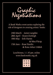
Graphic Negotiations #1: James Langdon – full video and transcript
In the first of our series of conversations with designers, Graphic Negotiations, we were delighted to welcome graphic designer, writer and professor James Langdon in March 2022 for a fascinating talk and presentation about his practice and thinking about designing artist books as an act of impersonation or negotiation. Below is a full verbatim transcript. Click here for a plain-text version compatible with screen readers.
GAVIN EVERALL (GL)– Hello everyone. I’m Gavin Everall, the director of Book Works Publishing and I’d like to thank you all for joining us today for Graphic Negotiations. And the first event in this series of talks with graphic designers that Book Works has worked with in the past. Just as a polite notice, just so everyone knows we’re recording this event for our archive and I hope that we’ll be able to share it in the future.
The idea for this series was initiated as a result of really positive feedback that we had about the participation of Michael Kelly, one of the designers at Fraser Muggeridge studio, at an event we organised with Praneet Soi and The Mosaic Rooms for the launch of Praneet’s book, Anamorphosis, and we thought there was a real interest in understanding how we work with graphic designers and how collaboratively we work together with artists. So, following this event we have planned future events with Rosen Eveleigh on the 28th of April, with Erik Hartin and Moa Pärup on the 18th of May, and with Rose Nordin and Rosa-Johan Uddoh on the 15th of June, all of which will be a lunch time, one o’clock.
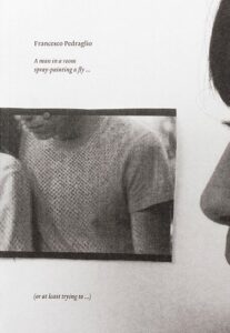
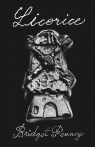
And today, we’re really pleased to welcome James Langdon, a proud graphic designer, who has worked with us on a number of projects with artists Katrina Palmer, Francesco Pedraglio, Gavin Wade, and the touring exhibition and publication Again, A Time Machine, a project that I’m sure he’ll refer to, and one that’s a really good example of the collaborative approach we encourage. Currently, he’s working on a series commissioned from open submission, titled Interstices, guest edited by Bridget Penney, which has published Licorice by Bridget herself and forthcoming projects with Diana Georgiou and Harun Morrison.
And finally, before we start, these talks are aimed at exploring the collaborative relationship between Book Works, the publisher, the commissioned artist, the designer, and the reader, the audiences for the projects. And it’s really focused on the outcome of that collaboration, the books and the programme that surrounds them. I hope you’ll be able to come to the next events and if you’re interested in building a collection of Book Works publications, please have a look at our recently launched Readers Club, which for £5 a month or £50 a year, you’ll receive a copy of each of our new publications as they’re published. And you can find info about this on our website or on the chat. And so, James, it’s really a great pleasure to introduce you and thanks very much for coming today. Over to you.
(PAUSE)
JAMES LANGDON (JL) – Hi, everyone, I hope you get my audio now… Looks good. Looks like I’m not muted.
TAMAR SHLAIM (TS) – We can hear you.
JL – Great. Thanks Gavin. Thanks Tamar. Nice to talk to you everybody. I’m very happy with the title that you chose for this, Graphic Negotiations. I think this word negotiation, it fits really well for me with the kind of vocabulary that I would use to talk about what I do. I think I’ll talk for 25 minutes or 30 minutes. So that gives us definitely time for questions, if you have some. I’ve organised it in two parts. First one will be a kind of amateur, recent, history of graphic design for contemporary art. And then second part, some kind of more specific examples of things that I’ve made, most of them with Book Works, where we might get into a bit more of what kind of negotiations are we talking about and what are the stakes? Now, let’s try and get this working, that you see some images. Oh, Tamar, I also need to be able to screen share please.
TS – I think I’ve just given you permission. (04:43)
JL – Oh yeah. Great, cool. All right, hopefully that comes on now. So, as a slide to start with, I’m kind of using this to represent something like, a point in the 60s, 70s, where the idea of the artist book in the US and in Europe took on this very particular kind of expression. It’s quite a reductive expression, as you can see from the graphic perspective. But it’s a particular format for conceptual art. This book, as you can see, is a book by Robert Barry, I’d say it’s fairly typical of the whole genre of conceptual artist books that are minimally expressed graphically, but use something quite explicit about the format of the book as a site for an original work. I’m not really going to talk so much about the form of this but what’s interesting to me is the idea that as a piece of artistic and editorial and graphic and distributive labour, this is such a singular kind of object! A book like this has no colophon, it has no page in the back with a list of processes and names. It just has this one name on the cover. And the assumption is the concept, the typography, the layout, the printing, possibly even the binding and the distribution are done by that one person—the artist named on the cover.
In my mind, that kind of artist’s book, that very singular conceptual proposition that belongs in a book is against this, where this image stands for something more like the conventional art catalogue. So, what you see here are artworks being literally catalogued, reproduced, itemised, numbered, described. The artist book is against that, it’s against reproduction, against remediation, it refuses to commodify the existing work.
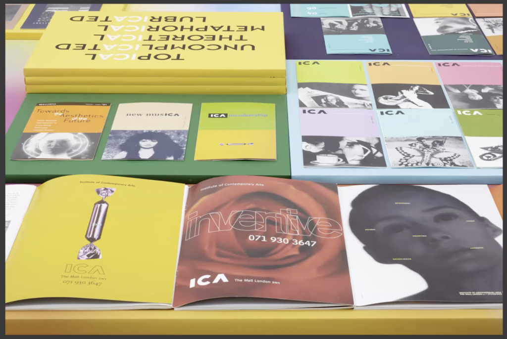
But in 2022, in contemporary practice, that term ‘artist book’ probably typically describes or at least now encompasses something totally different. A production of this, this was actually published last year, not designed by me, it’s designed by a Swiss studio called Maximage, and it’s a book for a Swiss artist called Raphael Hefti. Each copy of this book has a unique cover, made by the artist at the studio of of a very celebrated art printer in Zurich. And inside the book, this thing is a kind of highly technical object of graphic and industrial design that probably cost 40 or 50,000 euros to realise, involves custom six-colour, digital six-colour printing, using digital colour profiles, researched and developed by the designers; combines numerous digital, technical, manual, conceptual, interpretive practices that no one individual could produce alone. So, I’m interested in this kind of—how the colophon situates these two completely different ideas of what an artist book is or was, from something where one person kind of controls the whole thing and conceives of it as a as an artwork in itself, to something that involves this really long list. On the right is the colophon of the Hefti book—this really long list of processes, contributors, individuals, institutions. And not just a list, I would say that this is more than a list, this is kind of a roster. You know, that part of the practice of design for contemporary art is about working with the best people, the best printers, the best photographers, the best designers. This list also kind of represents the aspiration or the network of the artists that it represents. (10:17).
I can’t see the chat. Maybe I should see the chat… in case anything terrible is happening. I can’t bring it up now. Tamar or Gavin, if something terrible happens, can you tell me?
TS – Yes. I’m not sure how to show you the chat. But I will tell you if they start booing or heckling.
JL – So if you can accept that quite reductive contrast between one idea of what an artist book was in the 60s—70s American/European conceptual art context, and what it might be now, in a similar demographic maybe, but in this completely expanded kind of production, I would try to build on that by explaining something of how we got from one to the other. I do that absolutely not to claim a definitive history there but just to show something of how I personally make sense of that recent history in relation to what I do. Here you can see some images of publications and ephemera designed by Tony Arefin. And you’re seeing them in exhibition views of a show that I organised at Ikon Gallery in Birmingham in 2012.
When I first got interested in graphic design and contemporary art, someone that I worked closely with at that time introduced me to Tony Arefin’s work. He was very active in the London art world of the late 80s and early 90s. And to me, he represents this very particular proposition. He was taking what you might say were the most lively and inspired aspects of graphic design at that time, which he was finding in magazine culture, graphic design for music, and he was bringing them into the art catalogue. If you think back to that image of black and white etchings that I showed and told you is a typical art catalogue, Tony Arefin was kind of like blowing away the dust of that kind of very conservative type of art publication. And bringing in these colourful, graphic, really dynamic elements from magazine design, and music design.
I want to give you this one kind of term that sort of sums up for me the transformation that his work represents in this kind of cultural sequence. And that term is “art directing art”. So, that’s kind of a weird proposition but I think, in magazine culture, the role of the art director is quite well understood. You’re someone who commissions photographers, illustrators, artists, to generate the visual material that goes into the editorial production of a magazine. In the art world, in the art catalogue, that kind of role did not exist, because of course, the artist provides the visual material and the publication itself exists just to document that material. But Tony Arefin, quite often in the context of group exhibition catalogues, like this one, or this one, but also solo catalogues. This is for Cornelia Parker at the Chisenhale Gallery in 1990, I want to say. He was kind of bringing this idea of art direction to the contemporary art catalogue. So, generating images himself or using found images to completely stylize art publishing in a novel way.
(PAUSE) I’ve gone off script…
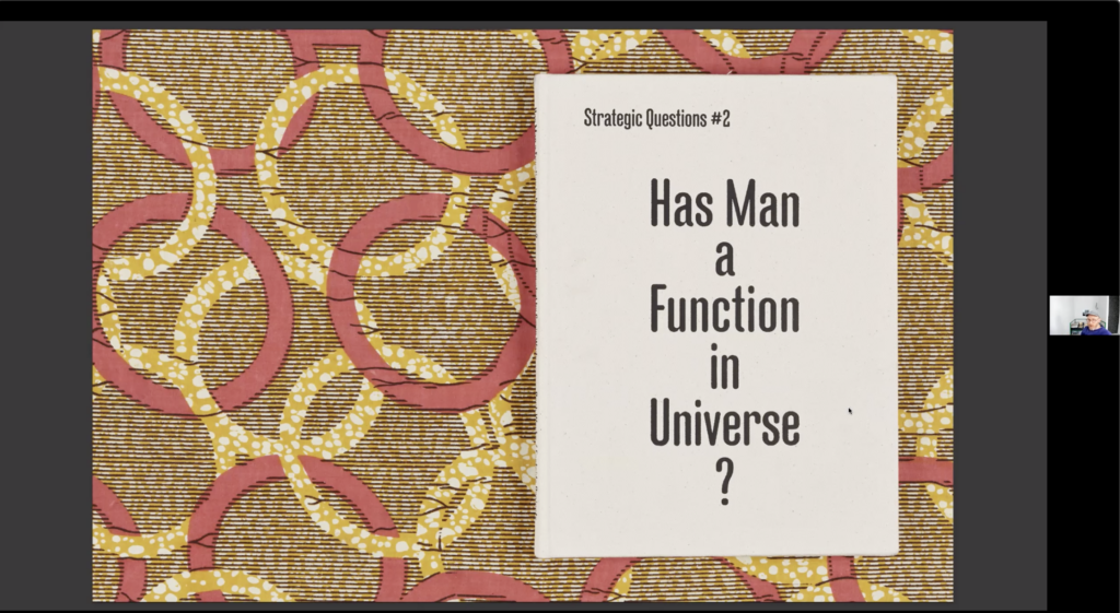
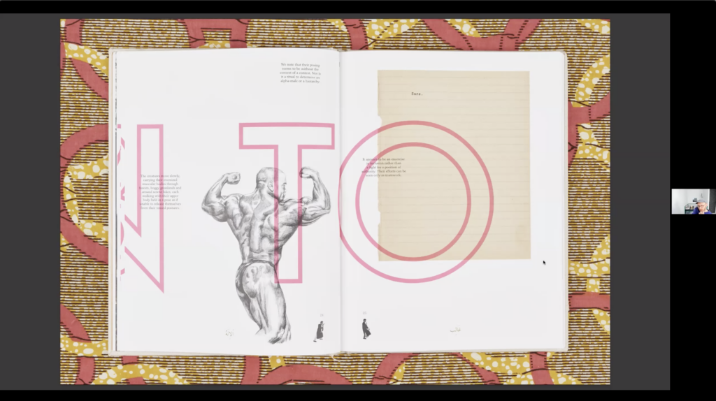
Okay… So, I’m showing you now, a book that I designed. The first book I designed for Book Works in 2008 [Strategic Questions #2: Has Man A Function In The Universe?]. This was made in very close collaboration with curator Gavin Wade, in Birmingham. I lived in Birmingham at that time with Gavin and a group of others was involved in running a small space there called East Side Projects. And this book, for me…I have come to graphic design quite late. I studied as an artist, and I’d worked in galleries before beginning to practise design myself. And almost in a completely parallel narrative of having relatively few design skills, the first kinds of publications that I’d made had been completely in that template of very conservative, minimal looking exhibition catalogues, just purely for the reason of, I didn’t really have the skills to make anything more elaborate or dynamic. But Gavin was someone with this really unique, exciting curatorial proposition where he constructed environments to exhibit artworks, not in this kind of this quite conventionally discreet way of showing one thing at a time with plenty of white space around it. But in this completely kind of layered and amalgamated view. The publication that you’re seeing here is one in a series of publications that we did. It’s basically a group exhibition in a book form. So, on this page right now, are works by several artists, the page numbers and photographs in the bottom are by Shezad Dawood. The large pink text is Mark Titchner, the bodybuilder is Karin Kihlberg and Reuben Henry, the scan of a piece of paper is Hayley Tompkins, the whole book kind of proceeds with this visual language of layering things on top of each other, and making no attempt to, sort of, reconcile things in relation to one another according to that quite conventional language of exhibition installation. So, you might go from this page to this page, to this page. (17:46)
The word negotiation from the title of this series completely applies here because everything that you’re seeing, this combination of multiple artists work in one space, is the kind of negotiated practice of Gavin as a curator. So, through his energy and persuasiveness, making these artists…or convincing these artists to agree to having their work presented in this way.
I’ll jump to another project which came two or three years later, also with Book Works. Gavin [Everall, Book Works’ Director] mentioned it, this is the series of announcements that I designed for a series of exhibitions that Book Works was organising to celebrate this anniversary. I can’t remember which anniversary it was, I want to say 25 years, but I think we weren’t very explicit about that at the time. So, I should have said this before maybe, but in that kind of rough narrative that I gave you in the beginning, that there was this kind of transformation of the artist book from a singular, autonomous, made by one person thing, to this potentially lavish, collaborative, networked object. I feel like Tony Arefin’s place in the middle of that also coincides with the existence of publishers like Book Works, where the artist’s book is not, any more, this kind of completely singular production. It’s being elaborated and artists and graphic designers are beginning to collaborate. I’ll talk a bit more about that in a moment.
The visual language of this series of announcements was in my mind completely following on from this work. So, this really became part of the graphic vocabulary that I wanted to explore. And the way it was formulated for this series, there were I think, six of them, I’m just going to show you a couple. And they each had this very strict format. It was A4, four pages, when you opened it, the left page was labelled ‘back’ and the right page was labelled ‘forward’, like this. And we conceived that as this kind of editorial device that we would use to sort content. So, in relation to this kind of proposition of the time machine, in ‘back’, we would place material from the Book Works archive, and in ‘forward’, we would place new commissions and material relating to this programme of events and exhibitions for the anniversary. And then once that kind of strict template was established, of course, it became kind of the game to put things across that transition and play with those two states in time (21:14).
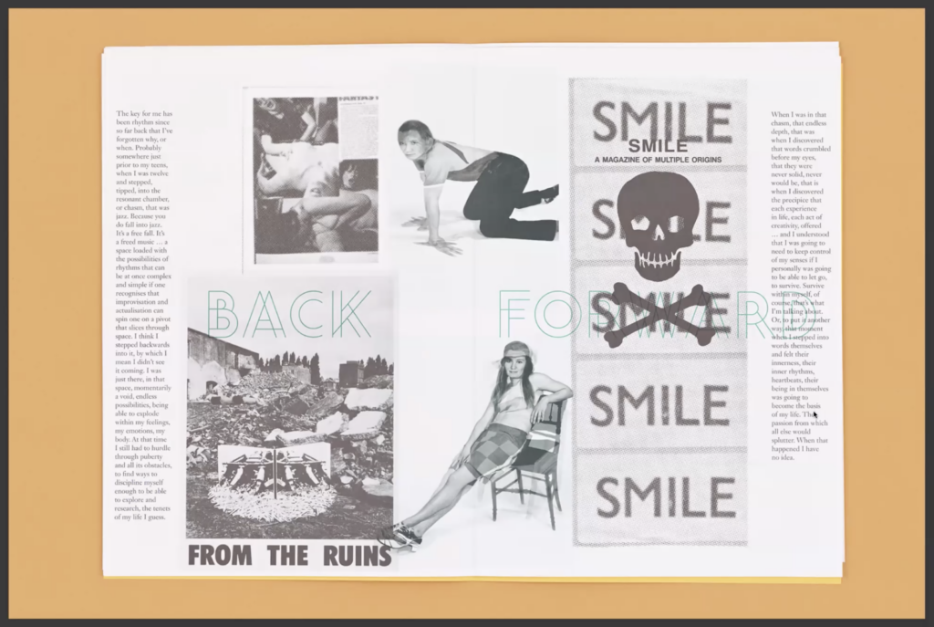
I’ve got a really good story about this piece of work. So, this was done in 2012, and around that time, I got this invitation to come to the Serpentine Gallery in London, where they—I think they still do it— maybe they don’t do it. They were doing a series of annual marathons, and these events were 24 hours long, in the pavilion outside the gallery with a super intense programme of I don’t know, like 100 speakers, always on one theme. And I was asked to come and pitch for the graphic design of that year’s marathon. And we just—I think we were halfway through making this series and I was really happy with this work and really proud to take it with me to show at this pitch. And the work was on the table, the curator at that time at the Serpentine Gallery looked at it and looked at me and he said something like, “artists do not want this”. And I thought I understood what he meant, that this kind of layering and collision of different artworks that kind of interferes with an expectation of an artist about how their work will be communicated. And I thought, this will be okay, I’m going to respond to this by saying, “Don’t worry, everything you see here was very carefully negotiated with each of the artist’s work. Everyone approved everything during each step of the process”. And he just looked at me blankly and said, “’It doesn’t matter! Even if an artist tells you that they want this, they don’t want this!”. To me—I didn’t get this work, obviously. And I find that a really kind of interesting—to me, that’s quite a generational narrative where there’s a generation of curators who are interested in this kind of contextual practice where curating still means, in a way, to take care of an art, an artwork or an artist and to build up a consistent narrative around it. And this kind of graphic expression, of course, completely contravenes that. So, that’s an interesting reference point in my mind.
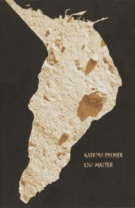
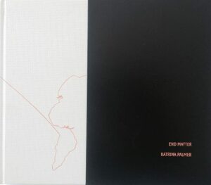
I go on to show you—So we’re into the second part of this two-parter, where I’m going to show you some more specific decision-making moments and talk a bit more about relationships between the graphic designer—normally me in these cases—and artists that I’ve worked with, again, mostly for Book Works. This was a Book Works book for Katrina Palmer, this was done in 2014, I think. What you see there is the actual cover that was used for this project. It’s a novel. It’s set on the Isle of Portland. This map that you see on the right page there is kind of quite a significant part of the book. It’s this moment in the book where each of the locations that are significant in the narrative are being mapped out (25:04).
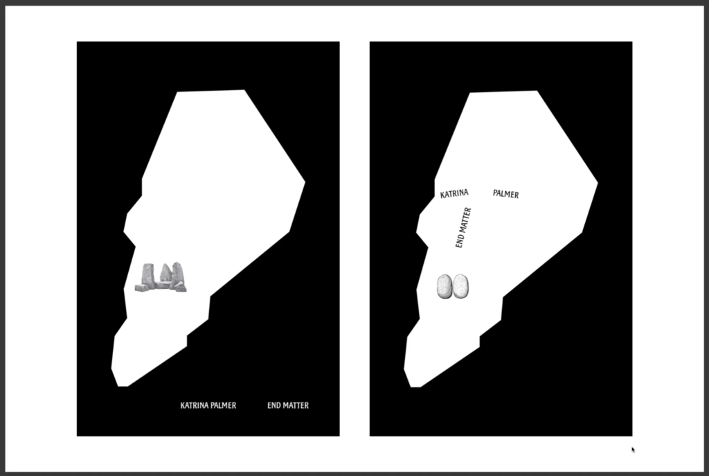
I’m going to show you this series of cover proposals that I made for this book. I didn’t know Katrina before we worked together. And I feel like that’s kind of a really crux factor in any relationship between an artist and a designer, is how that relationship came to be. So, in this case, I think—maybe Gavin will remember this better than me—but I think Katrina asked for me. So, she probably had seen something that I’d made in another context and thought, “that person has a sensibility that is fitting”, or—I don’t know, I couldn’t speak on her behalf. But I got really convinced that this map should represent this kind of crude face and the rocky landscape of Portland, which appears also in some photographs in the back of the book, which this thing you see there, on the left is one example. I thought that they had to feature, that this kind of, sort of dumb, crude way of presenting the cover was appropriate. And I remember the meeting where we discussed these being this kind of really deflating moment in a way where, where it was obvious to me that Katrina didn’t like this direction. And we ended up as you saw, with this. When I see this cover now, I still kind of like it in a way, but it really troubles me somehow, that the landmass extends off the top edge of the cover.
I’ll go on to describe a different kind of relationship in the 15 years, or even a bit more now, that I’ve been working as a designer with artists. I can think of only three or four really significant ongoing collaborative relationships in that time. One of those for me is definitely with Celine Condorelli, who I’ve made a number of publications with in that time. This is one of the most recent things we’ve made, and represents to me my own practice in relation to that second idea that I presented in the beginning of the introduction to the talk, that Maximage/Raphael Hefti book where you see this really kind of elaborative, elaborated, collaborative work between an artist and a designer. This is that kind of expression in relation to my work, where this publication includes some documentary photographs that you’re kind of seeing here of these sculptures that Celine made, that house planting. And these experiments that we made together with staining using plant inks. So, this is quite a small publication in terms of it’s only about 20 pages or something like that. But every page has this kind of combination of elements that are documentary elements, or new production, or their hybrid combination in some way. That kind of relationship in our case, has quite different dynamics and different dimensions, where for quite a few years, I’ve made—I’ve technically realised artworks for Celine, which have come from elements of things that we’ve made together in collaboration, or are much more purely kind of graphic design labour made to realise the form of an artwork as a print or something like this. (29:53)
Most recently, I made for her, for an exhibition at Nottingham Contemporary, these really large-format digital images that were used as backgrounds for this display. The images come from research that Celine made into the skin of octopi, or octopuses, I think I’m always being corrected to octopuses. And some digital imaging processes that I developed to try and simulate those effects. So, what I’m trying to show you here is the idea of this kind of relationship between an artist and a designer that then comes to many different forms of expression that might be differently balanced, or the initiative might be differently located between those two roles.
How are we doing for time? Reasonable. Okay.
Now, I want to show you a final sequence of works, which, let’s say, if I jump back a bit… This was made in 2018 but I would say, as I reflect on my own practice, all of the elements that you see here were already present. For example, in the Has Man A Function? book that I showed you from 2008, the first thing I did with Book Works. That kind of hybridity between those two forms that I showed in the beginning, the artist book and the art catalogue, but with its nature transformed by the influence of people like Tony Arefin.
So, within my practice, there’s been quite a long, sustained period of trying to work collaboratively with artists and find graphic expressions of their work. I’m going to show you—I’m going to skip forward to this. When I think about what that means, I think about this idea of graphic design as a kind of impersonation. Let’s say you’re a graphic designer, and you’re working on a publication for an artist, there is a kind of responsibility that you have, to engage with that artist’s work, to become familiar with their practice, and to express it somehow, to represent it in a graphic form. In my mind, you can extend that, you can emphasise that almost to this idea of impersonation, where you start to—I start to think about making the kinds of graphic design decisions that that artist would make if they were a graphic designer. I don’t have a lot of great historical examples of that kind of practice. This is one of the only things that I know, it’s not for an art publication actually, it’s for an anthology of this architectural workshop called Workship.
This is from 1994, and it was designed by Mevis & Van Dusen, in Amsterdam. And I’ve never read a statement of theirs about this book, and I do own this copy of the book, but it doesn’t describe anywhere in it what the graphic approach was. I just remember seeing a tiny picture of this reproduced in a graphic design anthology. And it was described as the designers tried to imagine the constraint of designing this book, during the workshop that it represents. So, the book documents this architectural workshop that was held annually on a boat, that’s why it’s called a “work-ship”. And this caption that I’m remembering, described the designers imagining themselves being able to use only the materials that they might find aboard this boat, so it kind of results in this—a bit superficial, but that kind of crude, lo-fi aesthetic as a sort of constraint that that determines the design decisions but also exists as this kind of conceptual layer. You know, the idea that the graphic designers imagined themselves speculatively in a particular decision-making situation. Now, I want to attempt to switch to showing you a video. Let’s see how that goes. Bear with me one second…(35:33)
Okay… I get the impression that this is going to work when I press play. This is a very short video clip. I’ll just play it and then talk about it after.
Okay, so what you saw there is a clip from a YouTube video by skateboarder called Ellis Frost. I think it’s from last year. When I saw this video, I was completely struck by this idea that totally resonates with my own idea of what it means in practice as a graphic designer to try to make appropriate decisions in the reproduction of an artist’s work. In this video, you see a clip filming—where one skateboarder films another skateboarder doing a particular trick while they themselves are doing that trick. To me, the kind of absurdity, farcical, but sort of conceptually quite poetic nature of that became for me a few years ago, maybe five years ago, this really kind of driving motivation in the relationships I had with artists and the decisions that I was trying to make.
So, I just want to show you one last example of a book designed in that spirit, which feels to me like it transgressed a border in a way, it went too far from the appropriate into the impersonation, towards something even a bit kind of uncomfortably cunning. The book was made for an artist called Sofia Hultén. I’m showing you here a picture of her work. She’s absolutely one of the most—In my eyes, one of the most inspired artists working at the moment. This is—every time I look at the pictures of this sculpture, I find it totally amazing. This object is a kind of ordinary chest of drawers pictured in the artist’s studio. She made this sculptural and video work where she restores the object to its kind of original condition, so takes away the paintwork, the damage, the dirt and markings to this. And then she reverses that process and tries to remake the original found object. So, the image that you’re seeing now is not the original object. It’s a remake, where she goes through this whole elaborate sequence of repainting it, splattering it, scratching it, spilling things on it, to get back to this kind of totally dark and disturbing idea of this object that contains all of these incidental marks but it’s absolutely not incidental, it’s absolutely intentional, like very kind of weird object, I find. And really stimulating to work with as a graphic designer. I’ve made a couple of books with Sofia, this is the most recent one. It’s from 2018, I think.
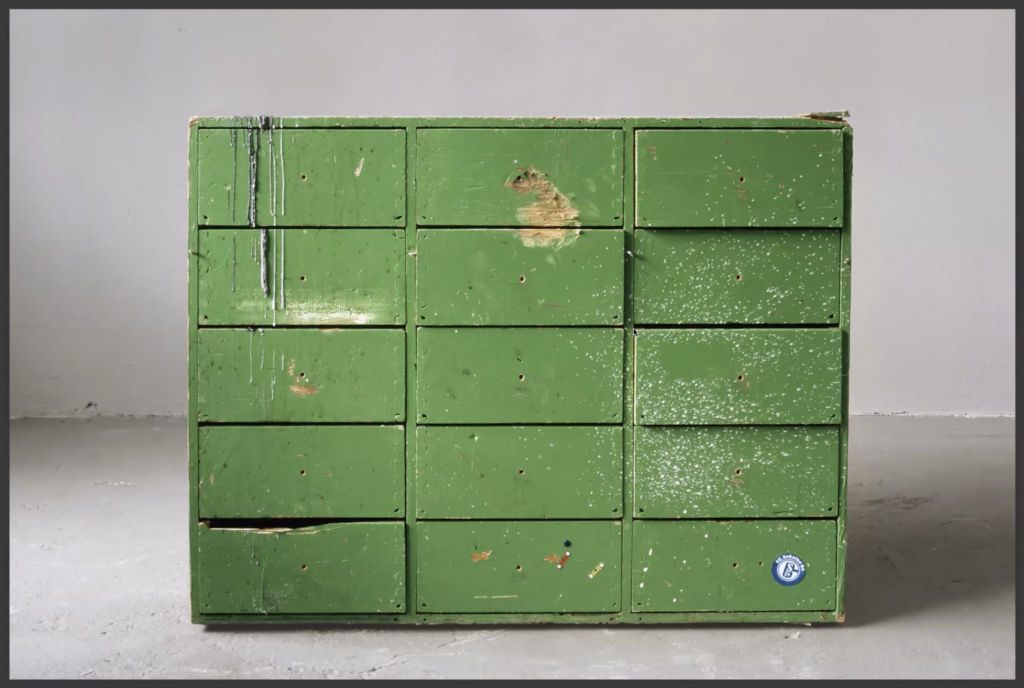
I always looked in dialogue with Sofia for ways or moments in the graphic design workflow where the kinds of conceptual devices that she uses could occur. So, this book is, in its kind of printed form, a relatively conventional monograph. You know, it just has documentary photographs of her work. That kind of cataloguing function that I talked about earlier where things are described, and itemised, and represented in photography. But the binding of the book had this really kind of unusual, anachronistic feature where you can see in the upper left of this image, the book is bound with these stab stitch staples. This is a very crude, kind of powerful binding process where—I’ve got a copy of the book here, you know, this is like 200 pages or something. The binding is maybe 15 millimetres thick and it has this staple forced all the way through the book block. So, it’s a very crude method of binding but, in this case, the time sequence of its production was kind of distorted. So, what we did was, when the books were printed, we had them glue bound, and shrink wrapped. So normally, the shrink wrap is the last part of the production process, you shrink wrap the finished books and you put them in boxes for distribution. In this case, the shrink wrapping happened before and the stab binding happened afterwards. So, when you peel off the shrink wrap from your copy of the book, you might never notice that there was anything unusual about that or you might find a tiny bit of shrink wrap stuck under one of those staples. To me, that’s a graphic design decision that sits right on this uncomfortable border of: “is that appropriate then? Or is that a kind of pun? You know, is that like a kind of impersonation of a…of an artist’s sensibility?” And there is another mitigating factor with this book, which is…hopefully, you can see me a bit bigger now. (42:20)
Here’s a copy of the book. Because of this stab stitch binding there, there are three staples, one in the middle and top and bottom. This book opens very poorly. Now, most artists will have their books bound with section-sewn binding and many European binders offered these kinds of more expensive, fancier types of glue binding, that are all aimed at making every opening in the book lie perfectly flat, you know, so that the book itself is a very good compliant display device that you can sit it on a table and really view the opening clearly. This book absolutely cannot do that, so that one design decision means that this book just wants to snap shut. I feel uncomfortable about that because in the moment where I conceived that design decision, I was so hungry for it to exist, so convinced that it was a kind of perfect graphic design mediation of that artists work that in a way, I let that become a kind of compromised object, you know, that it doesn’t actually function in one sense.
That’s the conclusion. I hope it was understandable. I’m totally—I haven’t been following the chat but I’m totally happy now for anyone to ask questions. (44:02)
TS – Thank you so much for that, James, it was really interesting. I hope it wasn’t too weird not being able to see or hear any of us. If anyone has any questions—I know that we said it would be 45 minutes, but I think we can go up to 2 [o’clock] if anyone wants to ask questions. I am going to set it so you can unmute yourselves, and put your video on if you want to, and you can also post questions in the chat. Okay, you should now be able to unmute yourselves and put your hands up if you want to. But we’ve got one in the chat here.
“Hi, James. Thanks for your presentation. In your view, are there significant differences in negotiating to arrive at a final piece of work in digital forms as opposed to a project in printed matter?” (44:55)
JL – Yeah, interesting question. I think my first reaction to that question…myself personally, I haven’t made so much web-based work. So, my first reaction was, that question implies this kind of distinction between print and digital, let’s say. Where print is this kind of fixed, and ‘once it’s made you can’t change it’ kind of medium and digital has meant something that is more easily reformulated, I suppose. But I think my impression of digital culture as it exists right now, thinking particularly about this kind of explosion of blockchain-based art, that distinction seems suddenly totally upside down again, where blockchains are being understood and valued as artistic publishing media because of their being immutable, you know, this idea that when something exists on the blockchain, it is then fixed and proprietary and cannot be undone, you know, isn’t subject to Apple Z, or any of those metaphors we have for how you interact with a digital object. So, to answer that question then, a bit more specifically, I think, yeah, the answer for me goes back to that thing I showed in the beginning about how expensive and elaborate can be a contemporary artists publication where the capital risk of making mistakes also produces a kind of conservatism, I guess. The example I showed you of the Maximage book, that’s quite an exceptional object, you know, it’s such a, at once physical and digital piece of design. Yeah, that’s all I’ve got. It’s not such a direct answer. Sorry. (47:26)
TS – Do we have any other questions?
AUDIENCE MEMBER – Yes, I will have one. That’s over here, Paulos. Many thanks James, for your talk. It was really, really, really inspiring. I design a few books now and then as well, and what I’m very much interested in is also negotiating the non-present audience and the public, the readers, and I find this very difficult with an artist book, because as you correctly said in the beginning, they are an original artwork themselves. And then the book took on— did not take on, it always had this function of being an object of disseminating information, disseminating things to a wider audience. And a lot of the aspects that you mentioned are wonderful interpretations of, you know, the art directing and graphic designer and the art directing graphic designer. But I wonder at what point we alienate an audience, and I say we because this might happen to all of us who are working within books, and to what extent are we going to— or how do you negotiate that aspect? So, your idea plus the artist or the other way around. So, the artist’s content, your interpretation of it, your art direction of it, and then an additional variable, the audiences. (49:02)
JL – Yeah, yeah. Thanks Paulos. I feel quite exposed by that question because I think the kind of mentality that I’m describing is all about bringing a kind of conceptual decision making into a negotiation with an artist where the objective, really the kind of overriding motivation for me is to satisfy the artist, that the object that we are making is a good representation of them. But then, you know, for probably more egotistical reasons, to have that object be made with the motivation of it kind of fitting into my own narrative of, ‘what kind of graphic design practice am I inspired by or inspired to make?’ So, I think I’ve made a lot of decisions of that nature. Some of the things I showed in the beginning of the talk about this very kind of layered visual vocabulary, I think it also applies to them, where they very often prompt this question of, “Is that the most easy to read presentation of that material?”, and in my mentality, I always kind of—I might try and make a reasonable answer to that question but I always discount that, you know, I always think that’s not the important thing. That’s not the signal that I’m really trying to boost.
TS – I might just add to that, if that’s okay? To sort of say that in some ways, I think, you know, that’s the publisher’s role. I’m sort of marketing and communications and I will say that, you know, I’m further down that end of translating things to the audience and I think, you know, in a way, the sort of designers and editors are like the first step between artist and audience and then you’ve got other roles in publishing where our role is more to try and channel things in that direction and I guess that’s where a lot of the tension in publishing artist books comes from. And we’re quite unusual in Book Works, in that it’s not so much of a tension, actually. I think, you know, that we all sort of participate in other ways and it’s quite collaborative, whereas in more traditional forms of publishing, it is very often a real fight between sort of designers and marketing who are saying “No, you just have to have all the info really big on the cover!”. (51:46)
JL – Yeah, totally.
TS – Any other questions, comments? (PAUSE) All right, well, maybe that’s great. We’ve managed to keep it under an hour. So, well done, thank you everyone.
I’ll just give it a sec in case anyone wants to pipe up…
Thanks very much, all for coming! The next one of these is going to be with Rosen Eveleigh on the 26th of April. It’s also a Thursday lunchtime, so look out for that! And sign up to our mailing list if you want to be notified. I’ll stick a link in the chat. Thanks so much everyone. (52:40)
JL – Thanks for your attention everyone.
GE – Thanks very much, James. And thanks everyone for coming.
Bye for now.