Graphic Negotiations #2: Rosen Eveleigh – video and transcript
As part of our series of conversations with designers, Graphic Negotiations, we were delighted to welcome graphic designer, researcher and teacher Rosen Eveleigh for a chat on Zoom on 24 April 2022. Below is a full verbatim transcript. Click here for a plain-text version compatible with screen readers.
ROSEN EVELEIGH – As part of the teaching that I do at the Estonian Academy of Arts (EKA), I organise a lecture series which is called Graphic Design Confabulations, which we just had the last one of yesterday with Taylor Le Melle. And so yeah, it’s actually quite strange in a way because I’ve sort of been used to kind of being on the other side of this kind of situation, hosting people and asking them about their work, and how it kind of relates to graphic design practice. So, I’m a little curious to see how this is gonna go.
I sort of thought it would be nice to structure this in three parts. The first part is, I want to talk a bit about some research I’m doing on queer and trans printed matter periodicals, journals. Which I also think is kind of nice to talk about because I don’t really know where it’s going and I think is kind of nice to talk about, you know, in these kind of presentation moments you always have this feeling like – often there’s a kind of self-presentation of slickness and togetherness and finality, and I want to kind of make myself maybe a little vulnerable by saying, this is just what I’m looking at and thinking about at the moment and I don’t know where that research is going yet. Then the second thing is, I want to read a short text that I wrote for a project run by two of my colleagues at EKA, which is called Dear Friend, and it’s a short text that I wrote, actually kind of largely inspired by working on the book with everybody. And I thought it would maybe be a shame not to. And then I want to just talk a bit about some work that I do. That I’ve been working on. And for that, I’m also going to just try to show some stuff on the screen. Yeah, if there is any kind of questions or things that come up, feel free to jump in.
Alright, it’s always a bit like – I feel like there’s this kind of moment, right? When you share your screen, right? And you’re like, ‘Oh my god, I’m gonna get some kind of message from somebody!’ (LAUGHS) It always feels very intimate and strange to do this. Nevertheless, here we go… So, I don’t mind that you’re seeing this stuff on the side, maybe you don’t either. But can you let me know that you can see it okay?
TAMAR SHLAIM – Yeah, all good.
ROSEN – That’s fine, right?
TAMAR – We can only see that programme.
ROSEN – Ah, you can’t see my emails? (LAUGHS) You can’t see my emails and my messages?
TAMAR – Unfortunately not.
ROSEN – (LAUGHS) Alright… Also, the great thing that I learned recently is you can do this thing, which is hide self-view but I can’t do that right now. That completely changed my whole relationship to Zoom, I have to say.
Anyway, so yeah, my name is Rosen Eveleigh and I am a graphic designer. I work by myself, well, let’s say for myself, actually, definitely not by myself but for myself. I’ve run my studio for quite a long time really, I’ve never really had a proper job. Well, I actually have had lots of small proper jobs but let’s say I’ve been running the studio quite seriously, I think from since 2015, working together with all kinds of people, publishers, artists, curators….Should I be keeping an eye on this chat? Maybe you can let me know if there’s anything that comes up?
TAMAR – No, no, you’re fine, I’ll keep an eye on the chat. (04:27)
ROSEN – Alright, okay, cool. Yeah, and then in kind of collaboration with other kinds of practitioners, let’s say, like programmers, type designers, other graphic designers, editors, and so on. Largely, I suppose, in a way for the kind of cultural field, and I’m kind of interested in that kind of domain. And then yeah, alongside that, I teach, as I mentioned, and I also sort of run a couple of projects. I run a project with a friend of mine, which is called Butch Camp and I’m doing research and writing a little. So, as I said, I thought it’d be nice to maybe just start with the kind of stuff in progress or the things that I’m looking at. So, I sort of wanted to end with Dark Room, but I suppose I also kind of have to begin with it too. I have always, you know, as a queer person, looked for myself in printed matter, you know, as a kind of graphic designer, as a queer person. Yeah, looked for, I suppose, being particularly sort of drawn by the kind of shape of a journal or shape of the magazine in the way that it self-contains a kind of culture or a world-making between and for people, and forms sort of networks by means of its distribution. And that’s kind of how I got into doing the project because I’ve been kind of familiar with On Our Backs, for which Phyllis Christopher worked, and other kinds of materials surrounding that that I’ve been looking at.
But more recently, I’ve been looking at a few different things to do with trans culture and self-representation, and then again, a bit into this kind of sex-radical stuff. So, this is a really interesting magazine, in a way kind of the first widely distributed magazine dealing with what now we might call transgender culture, but then we might have called something else. It’s Transvestia, which was published by Virginia Prince in the sixties through to the eighties. It all started out as like a very small kind of mimeographed newsletter, which actually kind of interestingly was very small, it was supposed to be kind of held or hidden in the hand, and then later became kind of what you see here, which is a bit more of a professionalised and much more widely circulated piece of printed matter that was dealing with the politics of trans people at the time. And much like, in a way, sort of maybe like a comparable kind of like homophile movement. Like, for example, One Magazine, it was sort of in a way about peddling a sense of respectability and kind of normal, you know? Of being normal and presentable, and kind of part of society, really advocating for a position on those terms. I’m very much interested in the social and cultural contexts in which in which certain magazines were made, and then I’m also interested in their aesthetics too. I’m interested in the kind of negotiation that I have between those two kinds of worlds, let’s say – the kind of aesthetics and then the cultural and social and political production around particular kinds of magazines. And we’ll also maybe talk a bit about that later, the kind of aesthetics of, let’s say, design history, or something like that.
So in 1963, Virginia Prince states that the magazine is dedicated to the needs of the ‘sexually normal individual’ who has discovered the existence of his or her other side and seeks to express it. It’s also kind of written, in a way, in collaboration with its audience. So, there’s lots of submissions and interviews, and kind of write-ins and questions. Here are some other later issues of older, or maybe kind of presenting just like a bit more of a range of the kinds of visual styles that it underwent. And I’m kind of especially interested in this, in this kind of binary image that kind of happens or the kind of self-presentation of people for whom it was for and about. And then some other kind of material that I’ve been looking at is called Vanguard. It was a magazine that was produced in the Tenderloin in San Francisco, basically at the same time. And I’m really interested at the kind of tension between the kind of approach to do with the kind of politics of being trans, let’s say now, and also to do with the kind of aesthetics. (10:35)
ROSEN – So, Susan Stryker writes about this in her book, Transgender History, and really, in a way did like a quite remarkable bit of history around San Francisco at that time in this very particular kind of riot at Compton’s cafeteria, which was several years before Stonewall. And she kind of places that sort of politics really within the hands of drag queens and trans women, especially trans women of colour at that time. So, there’s a lot of things going on in San Francisco, also to do with rising gentrification, and pressure put on a kind of, in a way, gay ghetto that’s created in the Tenderloin. And this was a collaboration between a trans group, a youth group called Vanguard, and the Glide Memorial United Methodist Church, and they worked together to kind of produce this magazine, which was about their neighbourhood. And you can kind of feel the different kind of relationship toward aesthetics and about the kind of material, like here for example, there’s an image of people cleaning the streets and kind of thinking about the relationship to their neighbourhood. And then there’s poetry and submissions, and then there’s also an advert for a ball, right. So, all of these things are kind of sitting together and there’s a kind of different sort of self-presentation or self-articulation. And then later on, there’s something like Gender Trash, which is published much later, in the nineties, which takes up some of the kind of questions that Phyllis, or some of the questions that I suppose Phyllis and her contemporaries were thinking about as a kind of post-queer world in relation to the HIV/AIDS crisis and a total sort of neglect from the government, so there’s a kind of self-irreverence or a sense of humour and then a kind of aggression, and a lot of fun being had in this material. I wanted to add in just a couple of spreads from this, this is really terrific, I think.
And then kind of in a slightly different track, I’ve been looking, and recently interviewed Renske Schut, who made this magazine called Slechte Meiden, which is a magazine made in the eighties and nineties in Amsterdam, which is basically kind of like the Dutch On Our Backs. It’s really interesting, she was like a part of this radical, sort of lesbian-focused SM community around that time, and became a bit jaded, they kind of republished [?] in Dutch and became sort of jaded by the kind of group politics of the time, and she and her partner kind of went off and made this really incredible magazine completely – well, not on their own, very much in collaboration with lots of different kinds of photographers and authors, but pretty much on their own. So yeah, I don’t really know where that kind of material is going yet, I have a few ideas, but I’m in the middle, I’m in the middle of that soup.
So, I wanted to kind of use this text that I wrote last year as a sort of pivot maybe between that material and my work, I suppose, or how maybe I’m kind of understanding that work that happened on Dark Room, and I think quite recently actually had a couple of revelations about how difficult I’ve found it to kind of talk about what my role was in it, which I’ll get into maybe a little later. Yeah, so I’m going to use this as a kind of, I guess, big internet.
The platform for this is a kind of one-pager, folded up text that is posted to people and it’s organised by Sandra Nuut and Ott Kagovere who, as I said, are my colleagues at EKA, and I wanted to kind of use the opportunity to try to sort of articulate or let’s say, maybe not articulate but maybe complicate some of the things I was dealing with in relation to my research and in relation to my role on that project.
So, I’m just going to read it. It’s kind of weird to do for me in some ways, like I’m not really you know, this is not really my like – well, I mean, I actually do kind of write but it’s more under a sort of pseudonym so it’s quite sort of strange to articulate in this way. Anyway, nevertheless, let’s have a go, it’s one page, it should take about seven minutes. It’s also not designed by me, but it has a kind of context with it which is quite strange to work with. Alright…
Dear friend
Cut to me. A spotlight illuminates an empty stage, I lean into the dust-glittered beam huddling on the floor over a book cackling with unbridled glee. Who planted this here? Was this figure conjured up with the sole purpose to thrill me?
Esther: ‘If Kay had not existed, I might have had to invent her.’
Finding Esther and Kay happened just at the right time. I was several weeks into a residency high up in the Swiss mountains, where I was invited to work with a particularly uninteresting dead artist’s library. I was doing nothing but getting over heartbreak, morning coffee drunk while staring wistfully above the clouds forming across the neighbourhood valley made the emotional drama all the more fabulous. It wasn’t that I didn’t feel like working, the library was simply too homophobic. Trans people and queers appeared within the pages of its books, but only as textbook pariahs, salacious criminals, medical illustrations of biological ‘freaks’, or objects of heterosexual fantasy. I was struggling to joke myself out of these bad feelings, annoying myself with the question of what it might mean for me to point this out as part of the work. Then I saw it. Wedged amongst the German men on Philosophie II shelf: Margaret Mead Made Me Gay.
Margaret Mead Made Me Gay is a collection of writings by butch anthropologist heartthrob Esther Newton, charting her pioneering work on queer communities through personal and professional reflections. Tucked at the very end is an essay called ‘My Best Informant’s Dress: The Erotic Equation in Fieldwork’. Here lives Kay, a veteran resident of Cherry Grove, the long-standing queer Haven, located on Fire Island, who provides Esther with intel for her ethnographic research on the community.
– Oh, I’m gonna have a sip of coffee –
When they meet, Kay is in her eighties and Esther in her thirties. When I meet them, Esther is in her eighties and I’m in my thirties. Kay is a heartbreaker. A suave, wealthy flirtatious charming dyke who has both Esther and I crushing hard from the moment she rolls up on the boardwalk in her electric wheelchair, flashing her expensive dentures. So begins a pattern of flirtation and teasing between the two, propelled by the possibility of fucking, their desire traversing erotic experience across histories. Kay, Esther, and me, are brought together in a three-way tryst and the thrill of legs touching under the table.
Esther: ‘But now instead of having ideas, she embodies ideas. Kay spans almost the entire period from “smashing” and romantic friendship to the age of AIDS. When I kiss her, I am kissing 1903.’
Esther confesses she probably wouldn’t have fallen hook, line and sink-her for Kay had they met at the same age because Kay is more of a party girl than an intellectual. I’m not sure if their forms of lesbianism make them good boyfriend material for me either. If their forms of sexual legibility are interesting, it is because it describes a path to mine, not a mirror image of it. Their relationship validates my own horny feelings and how powerfully or honestly they might drive my work. I’m turned on by Kay and by Esther being turned on by Kay. Our three-way flirtation grounds the basis for trust and in turn an ethics of research – a methodology for queer work.
Esther: ‘My fieldwork experience has been fraught with sexual dangers and attractions that were more likely motifs than light distractions.’ (20:27)
ROSEN – Uh-oh! Perhaps I shouldn’t admit that I don’t really like capital letters Graphic Design, not the audience for it –
I find it hard to muster enthusiasm for a certain design-guy reverence toward particular artefacts and their makers, materials, timestamps. Recipes of information blunt the affect of objects. Feelings, emotion and intimacy too difficult to contain, become lost in favour of a simpler story. If the kind of design that floats my boat makes it into the canon, it can only be kept buoyant by holding on to my kind of erotics.
Sure, I’ll confess I sometimes feel the thrill of a beautiful poster while scrolling myself into oblivion – but I always felt a little cheap after giving it my like. I’m not interested in the aesthetics of design unless aestheticising cycles objectification back round to sociality. Instagram design might be hot if it were a real fetish, if variable type was a route to actualise bodily pleasure. But it’s too disembodied for me. I’m busy thinking about Boyd McDonald jerking off on his single bed at Riverside Studios while compiling Straight to Hell, the proto-queer zine that Boyd variably described as ‘The New York Review of Cocksucking’, ‘The American Journal of Revenge Therapy’, or ‘Just shameless, sorry’. I can’t commit to the purely visual value of a poster and its accumulating status as air-conditioned archival objet when I’m drifting into a fantasy of how the bodies writhing together smelt in the darkness of the club night it was promoting. The poster is useful to the extent that it brought people to the club. I remember you would say nobody knows texts like designers do, that typesetting requires you to delicately stroke the end of every single line of text. I’m trying to make a joke about ragging, but it seems I already have.
The lesbian erotic photography book I’ve been working on for two years is wrapping up – if you can imagine which one that is – and although it is my dream job, I actually haven’t got that much to say about my design decisions. It’s actually supposed to pass as a proper Art Book, so I played it straight. I mean, I hope that it will be a beautiful book, but I don’t care to claim that it’s possible to see the conversations that went into making it. Only we know the ways in which it required us to turn around our identities like 3D renderings; how sometimes revelatory and other times disappointing it was to realise we were asking ourselves the same questions as the people in the images were asking thirty years ago. Our friends’ and lovers’ names litter its pages and will be printed 3,000 times AND shipped to different parts of the world.
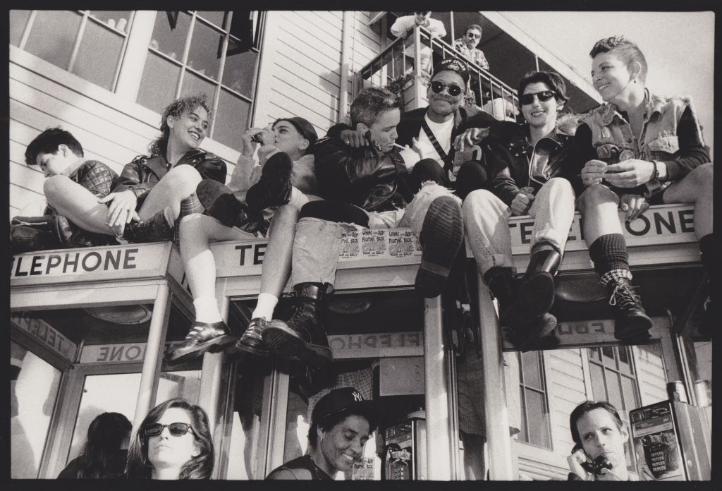
When I open that InDesign document, the first face in the first photograph on the first page looks so much like yours, I’m jolted across time to the year I was born. Suddenly it’s 1989 and I’m at the Castro Street Fair in San Francisco. A group of dykes wearing variations on leather and denim sit on top of a line of phone boxes cutting a mid-line across the photograph. I catch them in mid-euphoria, gassing and lighting each other’s cigarettes, arms around each other and gesticulating a story. Every time among the gazes, yours catches mine. In that moment we are held together. I give you a wink and continue with my work.
Rosen.
Alright. Maybe we can talk about that a bit later if there’s time. (24:00)
ROSEN – And then maybe I thought I would do a bit of a strange thing now where I kind of pivot to some things I’ve been working on in a kind of different context. And maybe sort of through that with the kind of memory of some of the things that I was thinking about at that time, I can talk about them. So, I think what I was trying to describe in that text is the kind of strange kind of alienation that I feel precisely when I show stuff that I work on, and show material that is finished, right, that has a kind of like self-presentation and a kind of articulation. I was putting together some of this material and like, faking it up, you know, being like, ‘Wait but how can I make this kind of look good or look convincing?’ You know, because often it kind of isn’t right? Often, the work that I do is like, very bitty, it’s very kind of around the edges, like, I’ll make a poster but then I also have to make, you know, 1,000 different other things that are much less kind of glamorous and useful. And yet, in a way I sort of have this feeling about what I can kind of get out of it, right? Or how I can sort of present it in a way that makes me come across as a kind of convincing person to hire. (LAUGHS) Right? In some ways.
So maybe I’ll just talk a bit about that. What I wanted to do in this moment is to try to make a parallel between the things that I’m showing and maybe what they actually were, you know?
I’m just going to talk about four projects, right? The last one being Dark Room. I work for a gallery in Birmingham called Eastside Projects, which actually I inherited from James, who was the last speaker. It’s quite an unusual gallery in the sense – well, maybe they wouldn’t call themselves a gallery, but a kind of multiverse. They’re quite unusual in the sense that I can really get away with doing – (LAUGHS) Oh, how do I phrase this? I can kind of get away with what I kind of consider undermining the kind of sovereignty – sorry there’s a tiny little fly here flying right in my – with no regard for my talk whatsoever – I can kind of get away with doing what I think is, or what I at least try to do is kind of undermine the sovereignty of graphic design’s role in self-presenting institutions and giving them authority. So, I never really came up with an idea, right? I was never like, okay, you know, here’s what I’m going to do, here’s how everything’s going to feel kind of coherent. This is like, you know, the system, this is the structure for it. There are a few things I do but by and large, it’s like the identity is me, let’s say.
This is the most recent kind of campaign we did, oh – the nearly most recent, which was a kind of three-part campaign, three shows, one which was the kind of main one was called ‘Loop’ which was created by Harold Offeh, and then there were two other shows that were in the second gallery. These also kind of act in a similar way, they have a kind of double-sided – it’s a double-sided card for the Sophia Niazi and Lady Skollie shows in 2019. And then what you can maybe start to see is that I’m sort of using the kind of detritus, or the kind of edges of people’s work. And in a way, kind of like recycling it or using the kind of edges of it, which is like, in a way, I think, quite similar to how, or like one of the kind of tenets of the gallery. And then you can see maybe that there’s another thing happening to do with the typefaces. I’m using a couple of different typefaces and I’m sort of pairing them together. So, one is by an artist called Bea Schlingelhoff, who makes typefaces as part of her work, and releases them for free. And when you’re downloading them, you often have to kind of sign, like digitally, let’s say, an agreement that you’re like an anti-Trump supporter and anti-Nazi… an anti-, you know, whatever, in order to kind of get them, and then it’s like her work, right? So, she’s also in a way kind of undermining her own value, or like complicating the idea of her value by distributing her own artwork through this kind of usable (STREAM GLITCHES) of a typeface. And then I’m often making one that’s kind of in conversation with her, and/or in conversation with the work that’s being shown.
So, these two are kind of interesting because they’re like, maybe not similar to something like this where you have a kind of back, you know, you have a relationship with itself. But maybe there are times where I have a kind of relationship to another poster. This is Emma Talbot’s show. And this is, this is Sonia Boyce’s show. (PAPER CRINKLES)
And then these are also some kind of slightly different versions of things I was making and testing out. Yeah, so here, you kind of see…
And I think in some ways, it’s like, strangely, it’s, you know, it’s kind of, like – (30:53)
ROSEN – There’s a kind of level, right, there’s a kind of experimentation that I’m allowed to do, which is very rare, actually, you know? In certain kinds of contexts. I mean, Book Works is one, right? You can kind of see that there’s a kind of value to a designer that isn’t present very much else, which is present at Eastside, right? Which I really have this feeling like, oh, you know, I can kind of take this, where I want and I can kind of change direction. And the idea to that is really, yeah, as I said, kind of, in a way about undermining what I, you know, almost think as a kind of fascist sort of approach to like, the branding of cultural institutions. I mean, I cannot tell you, like ever, basically, practically, every single thing I do I put the Arts Council logo on it, I think about it every time, like, it’s kind of what? Crying baby! You know, ‘I need my logo on it, too!’ You know? And in this context, I have a situation where I don’t have to kind of appeal to any of that, and I think that’s actually pretty kind of amazing.
So then, you know, I’m doing also, the kind of main – let’s say campaigns go through – have other kinds of forms to them, kind of like smaller, more ephemeral forms, these are gallery guides that are kind of given out for free at the show! There is kind of another set of guides that I’m doing in which this kind of like, let’s say, sort of ephemera, or kind of detritus, or like kind of edges of the work, get sort of brought through to the kinds of material you know? And it’s just kind of funny, I think what’s kind of interesting to note is that, like, you know, I’m making these look all the same, but they’re not all the same. I mean, this was the one of the first ones we did, and I hadn’t really worked out the format yet. But there’s a way in which I can kind of convince you that these are all the same formats, right? And that’s kind of my job too, to kind of add value and make something feel like a kind of convincing artefact. Then there’s a sort of set of envelopes they go out with where we kind of use this key which was also another artwork that was by Hardeep [Pandhal], which was used across the front of the buildings, which then we kind of overprinted over the top, so this is the Monster Chetwynd one. This is Freya Dooley’s show, which then also had these kind of things in the back too. And here are some kind of other ones, you know, more or less kind of in use.
So, they become kind of like, in a way, mini sort of mascots or something or – I think at some point I was also thinking about them as kind of other logos, right? But the logo, maybe would kind of change every time.
Alright, so that’s like that kind of pile of just pieces of paper, that is my work!
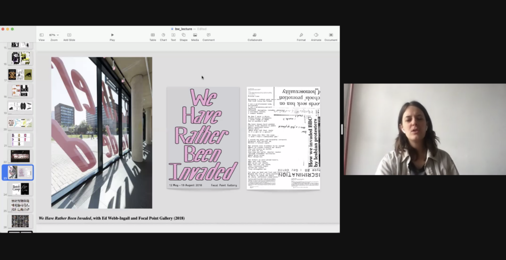
So, I work very closely with a person called Ed Webb-Ingall, who I suppose is like a sort of filmmaker, he’s also an academic or a writer. He’s a kind of facilitator, I suppose, in many ways, and he and I have worked together for quite a long time on various different sorts of materials. So yeah, and in a way kind of (STREAM GLITCHES) to form, or kind of manifesting elements of his work, which I think are kind of more difficult to explain, or more kind of immaterial. So, this is the very large-scale format window signage for Focal Point Gallery, which is a gallery in Southend. Here you can somehow get a bit of a scale of the thing, right? So, this is sort of, yeah, I don’t know – I can’t remember how tall it was, pretty tall! Let’s say, like fifteen feet or something. And this was as a result of quite a long process, also, by which we worked also with a group of kind of young, young, young, in scare quotes, queer people around the sort of legacy of section 28, which some of you might be familiar with, which is a clause which was in effect from the late eighties to the early 2000s, which banned the promotion of homosexuality in schools, which, in a way, also kind of covered both of Ed’s and my time at school, you know, in secondary education, and he ended up making a film about that. And then my response or part of that project was, we produced this poster, which was given away and had this result of some of this workshop and archival material that we were dealing with that was about the media presentation of questions around section 28 and various sorts of protests, together with a poem by [?]. And then we did this big intervention on the front cover…?! on the front cover of the library? (LAUGHS) On the front of the library! So, also kind of thinking about taking up a lot of space within this kind of municipal building. Reusing these the words that were spoken by Sue Lawley, during a protest by a group of lesbians on national TV, in protesting section 28. So, reusing some of the words that were kind of used against us, let’s say.
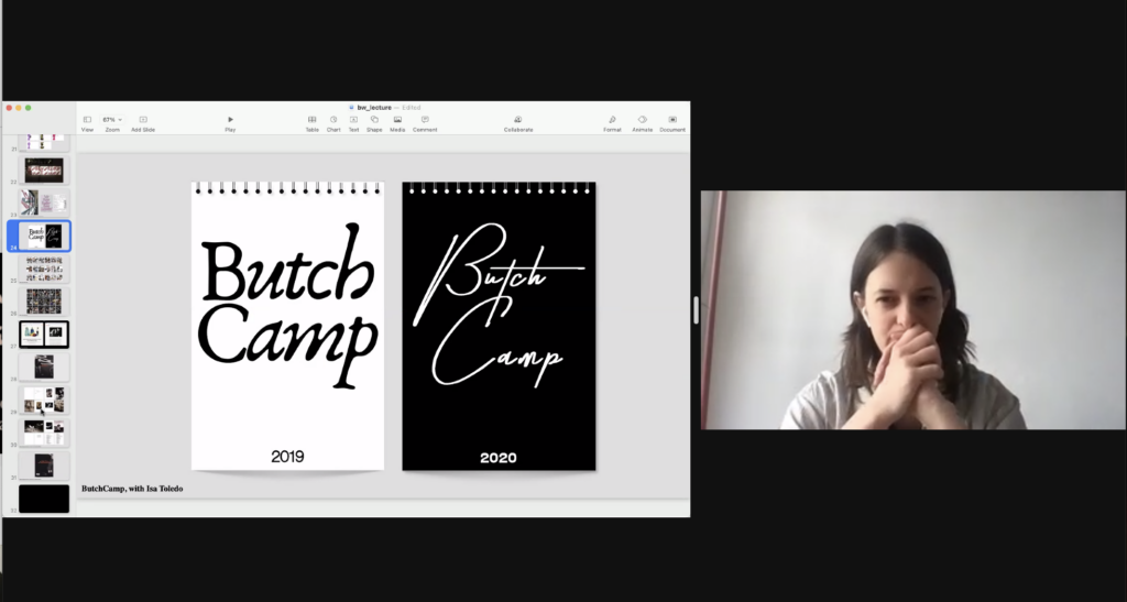
Another project that I work on, which is kind of a self-initiated project is with a friend of mine, Isa Toledo. So, it’s very much on my mind at the moment, because we’re just about to go to New York next week to do a residency at the Met Opera, which is absolutely wild for us. And together we kind of write and curate – not really curate – write – what else do we do? We’re kind of making work, I suppose, publishing and thinking through the kind of legacy or question of campness in relation to, let’s say, for want of a better word, a kind of sapphic sensibility. We were, as friends, I think, kind of annoyed that this kind of word or domain was often really kind of attributed to the sort of fabulous, and stylish, and funny, immaculate gay man and never, never to the lesbian, right? The lesbian was always sort of frumpy and not funny, and, you know, definitely not sexy! When, you know, in fact, in our experience, as people and in what we were interested in, we found really quite the contrary. So, we do kind of various works around that, one of which is we made two of these calendars. This is the one from 2019, I mean, just an absolutely ridiculous amount of cultural mining into many sorts of very stupid directions. You know, the best photograph I ever got of this was in my friend’s [?] mother’s bathroom. This was really it, this was the one from 2020. This is, I think, one of the best. I can’t explain it, I think it’s a joke between us and somehow other people seem to think it’s funny too. (LAUGHS)
So, on the back of some of this work, we got invited to write an article for Teen Vogue about the Met Gala, which a couple of years ago was about camp, which, of course, is actually mostly completely kind of misunderstood by the people involved. And from the back of that, we got this residency at the Met Opera. So, we’re going there next week to do something there. I mean, which is just – it’s really kind of outstanding, they’ve never really done that – done this before, had artists in residence. So, we’re really excited about that. (40:41).
ROSEN – Okay, so then, now I’m doing the big finale, right? Which is not really the big finale at all, but which is just to maybe talk a bit about a bit about Dark Room and maybe sort of circle around back to some of the things that I was talking about in that essay. You know, about… this kind of thing that often comes up in like, at least in my kind of design education, or some of the circles of people. Like, no shade at all to those people, but it’s like, well, what were your design decisions? You know, what were you kind of thinking about when you were making that? And I think – a few weeks ago, as part of Confabulations, J Dakota Brown came, who’s a designer and an academic based in Chicago to kind of talk about labour, graphic design and labour.
So, we’re talking about early kinds of typesetting unions and the kind of switch between the various technological shifts in typesetting. And it really – and I suppose it’s a bit fresh in my mind, but it really kind of began to kind of articulate for me why I find it kind of difficult to talk about, right? Or let’s say, what I was kind of thinking about when I was making this. One is that I wanted it to kind of look ‘proper’, me and Laura [Guy, Dark Room’s editor] right at the beginning talked about the way in which queer people, queer artists in general, but definitely sort of, like, specifically, you know, Phyllis and her contemporaries were just not taken seriously for a really long time, and in a way, kind of aren’t right? So, we wanted to, you know, in a way really kind of present the work in a kind of impressive way, right?
This is like a monograph of serious work and it really deserves a particular sort of attention to the design, but without being too invasive! There were some sketches we did that were like, you know, more or less, more or less kind of invasive, but I would say by and large, right, like I sort of said in that text, like, I tried to play it kind of straight for want of a better word. And instead, you know, rather than thinking like, oh, there’s this kind of smart idea, right? I mean, of course there are some kinds of like, textures to it, which has to do with the kind of typeface choice that I wanted it to feel very unapologetic, bold, you know, sort of ballsy. But more than that, I wanted it to feel—it was more to do the kind of materiality of the thing, but it felt like very well put together, that the paper choice was very specific, that the cover stock felt good, that it felt like a kind of impressive object that felt really kind of true to Phyllis’s work, whilst also kind of giving it – kind of appealing in a way to the kind of art contexts that it that it will be in. And so I think, just coming back round maybe to something that Dakota said in his talk, which was that, you know, in the history of graphic design, or in much of graphic design discourse, there’s this idea that you could kind of understand certain kinds of hierarchies through aesthetics. And he’s kind of turning this around and thinking much more about the kind of labour and work involved in certain kinds of objects. And that really started giving kind of voice to how I understand this, that like, I think, as I sort of tried to say in that text, there was a kind of – you know, without meaning to be to kind of in-crowd about it, there was really a way in which it felt kind of intergenerational, it felt like yeah, as I said, the sort of questions that we were asking ourselves, Phyllis and her contemporaries had asked themselves before… That, you know, I mean, the joke about ragging that I kind of can never really articulate is true, I mean, I must have touched every single letter, you know, definitely every single line in this book, there’s a kind of stroking and attention to detail to the images, I’ve seen the images extremely close up, I spent a lot of time editing them. There’s a kind of attention to detail there, which is, I think, which is relational and material, maybe like rather than aesthetic. And in that, I’ve also been thinking more about Leslie Feinberg’s book Stone Butch Blues, and there’s a character called Jess there, who is working as a typesetter (LAUGHS). So, just sort of also thinking about the kind of labour involved in that kind of work, or a kind of queer history of the design – in a way, I suppose, design labour, you know? What that kind of might involve, as I said, materially and relationally. (46:22)
ROSEN – So that’s what I have to say, I think right now! (LAUGHS) Now, I went a bit over perhaps. I hope it’s kind of okay to say things in a – yeah.
TAMAR – That’s fine. Thank you so much, it was really, really great.
ROSEN – You are very welcome.
TAMAR – Great to see loads of your work, and especially to hear the text! I’ve never heard of Margaret Mead Made Me Gay but it made me laugh, because we were just talking before this, I was joking about how I like to say Dark Room made me gay, working on Dark Room made me gay, it’s not really true, is it?
ROSEN – Dark Room made me gayer! (LAUGHS)
TAMAR – Made me gayer, yeah! (LAUGHS)
TAMAR – You know, I don’t know, I think it’s really interesting what you were saying right at the end there about the sort of relational element of it because in one sense, it’s a very historical documentary work, but it really doesn’t feel like that. And I think, you know, that, I guess, was part of the intention with the design and yeah, it feels like a relevant and contemporary document and I don’t know how much that’s – you know, I mean, on a personal level, I know – I spent a lot of time while working on it kind of fantasising about running away to 1990s San Francisco. (48:03)
ROSEN – Right! I mean, I think that’s kind of a bit what I mean, you know? I think, like, so often kind of design history is sort of told in this kind of set of ingredients that is to do with a format or material or the designer or where it was, and very little about, like, well was it a good party? You know, was it a fun party? Who was there? What kind of gossip happened? Like, was it… you know, like, what was the kind of affect of the thing really like? You know? And that’s why you made a poster, not because the poster is interesting!
TAMAR – (LAUGHS)
ROSEN – You know? That’s kind of a bit how I feel, of course there’s like, you know – that’s what I mean, of course, every now and again I think, like, ach! That thing is just so beautiful, right? Or, like, I certainly feel kind of like susceptible to that, you know? I can’t really help it but I think, for me, the sort of material – yeah, like the social relations around objects is what kind of makes it interesting… or sustainable, let’s say, to me as a practitioner, sustainable.
TAMAR – Yeah, I guess there’s always the tension of sort of, you know, do you kind of reify that? But through this and how do you sort of not do that but, I mean – I’m not gonna plug our own book too much. (49:17)
ROSEN (LAUGHS) – I mean, aren’t you?
TAMAR – Well that is my job, I suppose. (LAUGHS)
ROSEN – I mean, it’s an amazing book!
TAMAR – It’s literally what I’m paid for so maybe I should. (LAUGHS)
Well, I want to leave some time for questions but this is the book, it is very beautiful. Yeah, I really do feel like I have a sense of that sort of time now, which is probably – and I think it’s kind of interesting, like it’s made me challenge myself to sort of think about this fantasy lesbian utopia that it is in my head but then also, obviously, as is quite clear in the book, like, that’s not what the case was in the nineties at all, and like, part of these scenes of joy are reactions to stuff that we don’t have now. You know, would you have an On Our Backs now? What would it look like?
ROSEN – (HUMS IN AGREEMENT) Yeah, for sure.
TAMAR – Can that work in the political context? Anyway, sorry, I’m just talking now. We have just one question, which is, could you say again, the name of the type designer that you talked for?
ROSEN – Sure, it’s Bea Schlingelhoff I put in the chat, I think it’s the same. Erm… They’re often kind of like sort of sets of typeface and one of them was called Women Against Trump, for example. And she’s kind of naming them after, often kind of like activist, like sort of grassroots kind of activists, too. So, the one I often use is called like Lisa Fittko, for example.
TAMAR – Anyone else have any questions, you can unmute yourself, and just ask them if you want or post in the chat, and I’ll read them out.
ROSEN – You can do like anonymous, we also do it at Confabulations, like we do it kind of anonymously. So, it’s also kind of seedy but I guess it’s a bit more difficult to do it like that now.
TAMAR – Yeah, I don’t know if we can do that. I don’t know whether other people can see the chat but you can always DM it to me and I will ask it anonymously.
ROSEN – I mean, what’s your feeling about the—
TAMAR – That’s alright, we can talk until—
ROSEN – I didn’t know I mean, like, I suppose like, I find it kind of like, as if I’m saying something bad to say that we’re sort of adding value to – or like, what were the kind of conversations that you had around like, the kind of phrasing or like framing of, you know, Phyllis’s work through the book?
TAMAR – I mean, I came in at quite a late stage. So, Lizzie Homersham, who’s the Commissioning Editor, obviously, she has played the biggest role in thinking through those things. So, my role is more about literally selling, you know, selling the finished product, but presenting, how do we present that to the world? And so, I guess my, you know, my sort of – the side of it that I’ve had to work through is, you know, not pitching this as, like, here’s a history of San Francisco dykes because it’s not that. But, you know, it’s sometimes quite hard to articulate, like, all the things that it is, in a snappy marketing paragraph kind of thing.
ROSEN – Right! Yeah, but I’m kind of interested in that negotiation, you know, with like, obviously, I think, just working with you, and you kind of as an entity, as well as you specifically.
TAMAR – (LAUGHS)
ROSEN – Like, just sort of that feeling of, you know, of the kind of negotiation between the kind of complexity around, you know, a life, right, like, or lives, and relationships and what it means to make a body of work, or what it means to kind of be an artist. And then this kind of other moment, which is the Arts Council logo moment, you know? Where you’re like, oh, you know, I have to actually, there has to be a face to this, right? Which feels mobilised, you know? I’ve been thinking also, I mean, it’s strange to be on the other side of it now, but I mean, for example, like Harsh Patel, who’s a really incredible designer, who was the first designer, the first person I spoke to for Confabulations. He and I were talking a lot about this thing, right? That often sort of happens, where you have to sort of show that you’ve touched all of these things, like, I’ve worked for Book Works, I’ve worked for Focal Point Gallery, I’ve worked for this artist, you know, and all those things kind of are true but they, you know, what does it kind of mean to articulate them in a certain way, in a sort of forward-facing way that like, removes also like, you know, the crap, you know, like the sort of facts, or maybe materialities, or ephemeralities of those objects or of the kind of labour of that work. And I’m just really interested in maybe sort of foregrounding – in foregrounding the kind of ephemerality of material – you know, it’s like thinking about someone like Jose Muñoz, who sort of thought about that from a kind of performative perspective but kind of understanding and documenting kind of queer life. For me, it feels kind of like strategic or a way of dealing with that sort of self-presentation.
TAMAR – I think one thing that’s so great about working with Phyllis is her, like the materiality of her work and how generous she is with that. You know, like all the test strips, there was a Grand Union show where she just put out loads of test strips that people could literally pick up and look through, which is like, you know, it was really intimate and really great, really unusual, it felt, for a photography show, actually, to be able to touch anything. And then to have things you can look at… Okay, we’ve got questions. Should I read them out?
ROSEN – Oh, yeah, sure.
TAMAR (reading from chat) – How do you negotiate things like budget in the way you work? How do you make compromises whilst considering the social relations around objects etc.? Sorry if that’s kind of a crude question.
ROSEN – It’s not a crude question. It’s not a crude question. I try to talk about it to my students all the time, I showed them the contracts that I got for Dark Room, actually. I mean, I think it’s like a really important question, right, that people don’t really, people don’t really talk about very much, right? How do I negotiate things around budget? I mean, I think I’m still kind of learning a bit, like, how to understand, you know, the kind of proportionality between sort of how you just sort of maybe manage time or like, think about a kind of schedule. And in this case, right, I mean, I’m sure I’ve spent much more time than I got paid for it! Because I also kind of wanted to, and that’s a bit sort of what I – that’s kind of a bit what I mean, about this sort of strange area, right? Between like wanting to do something because it just makes you, like, horny, for want a better word, right? Or you’re like, oh, I just love this material, you know? I find it important and what that feeling is, right, is so kind of often co-opted by institutions that it is kind of a delicate balance, I think, between kind of working it out, I think I’m getting better, I mean, I was talking this morning with some people who we’re working on a project with, and getting kind of better at saying like, yeah, that is – I mean, I think it’s gendered too! You know? I think it’s like saying, ‘No, this is I think what I’m worth’, is like something I have to get used to, as somebody who was socialised as a woman. To say, you know, ‘actually, I think I should get paid more’, or ‘this is what it is’, and not feeling like – you know, feeling like, at this point, since I’ve been working for quite a long time, I kind of know what I’m doing. So, you know, I think it’s really, like, project to project and it depends on who you’re working with. You know, sometimes you don’t work with such nice people, and you have to just like get the money and run! Sometimes you work with really nice people, and you’re like, ‘No, I’m gonna be on press and sniff every page that comes out of the printer’ because you love it, you know? And you have to find the right kind of – for me, I think I can’t do it if I don’t – I can’t – I wouldn’t be able to do this as a full time job. I’m not very good at having a boss. I couldn’t really work for an agency or something for very long. And so, I have to kind of love it.
TAMAR – We’ve got one more question, but just because I know people will need to eat.
ROSEN – Yeah, and then let’s go and have some lunch!
TAMAR – I’m just going to quickly do this sort of marketing stuff. I’ve just put a link in the chat to sign up to our newsletter, if you want to know about new books coming out. Dark Room events will have some launches in London, San Francisco, New York.
ROSEN – Oh, really?
TAMAR – Is there one in Amsterdam, has that happened?
ROSEN – We had that, I had that one, yeah.
TAMAR – And also, I just wanted to plug our new support subscriptions. We’ve got like a supporters’ network where you can donate £10 a month and get invited to events and be a supporter, but we also have a Readers Club, which is a new thing where you can sign up for £5 a month and you will get all the books we publish, as we publish them. So that people that were signing up to that in March got Dark Room as their first bit. And the next one’s coming up are Battles Vol 1. by Francesco Pedraglio. We’ve got a book with Jesse Darling and Rosa Johan Uddoh’s Practice Makes Perfect all coming up soon. So, if you want to sign up, you get those cheap!
ROSEN – Wait, there’s one last – I don’t know if there’s a question?
TAMAR – Shall I read it? Do you want to read it?
ROSEN – Yeah, let’s give Nick – can we give Nick the final hurrah?
TAMAR (reading from chat) – Thank you so much. I don’t think I’ve really got a question as such, actually, but I wanted to say, as a young queer person, I often worry about finding community, especially leaving university where community feels semi readymade or more obvious and accessible. Listening to this talk has been quite kind of eye-opening and reassuring that these communities have existed for a long time. So, thank you.
That’s a nice note to end on. (1:00:18)
ROSEN – Oh yeah, for sure! You got to find it, it might take a while, it took me a while.
TAMAR – Yeah, I talked to Phyllis about this actually, I was like, ‘Phyllis, is there an equivalent now?’ Like, ‘what’s the equivalent now?’ She was like, ‘I don’t know, but I bet there is one.’ Like, there’s probably little ones everywhere, you know?
ROSEN – For sure. And I think, you know, I think that for me, it was actually, I have to say, very comforting too, you know? To feel like I was a part of a – you know, obviously the kind of question of like, genealogy is quite complicated in a queer context. But like, I think that I found that really, I also found that reassuring, too, you know? Yeah. So, thank you for that, Nick. And also, thank you, Caitlin.
TAMAR – Right, thank you all so much for coming!
ROSEN – Yeah, have a lovely afternoon! Thanks for joining! Alright, see you soon! Bye! (1:01:27)